COLUMBIA REGIONAL AIRPORT
COLUMBIA REGIONAL AIRPORT
Explore More
The Challenge:
Columbia Regional Airport wanted to promote the new terminal while introducing the updated branding. The objective went beyond simply informing the public about the terminal's opening; it was to instill a sense of pride within the community for having such a remarkable airport facility in the area.
Our Solution:
A comprehensive campaign centered on two key aspects: the brand tone and the brand story.
Brand Tone:
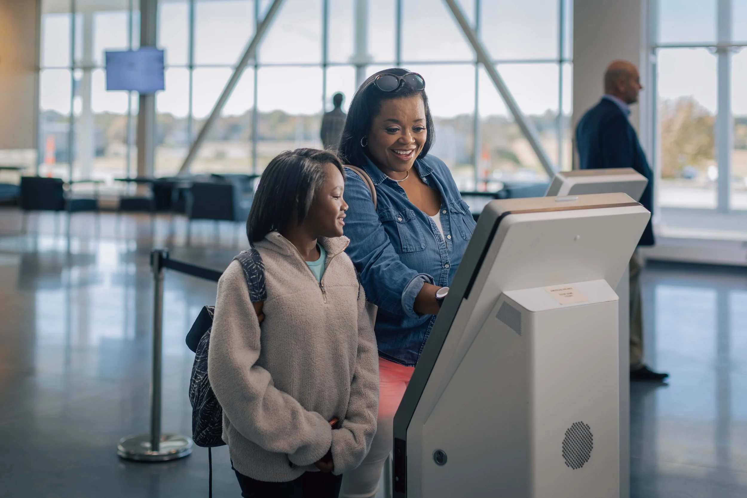
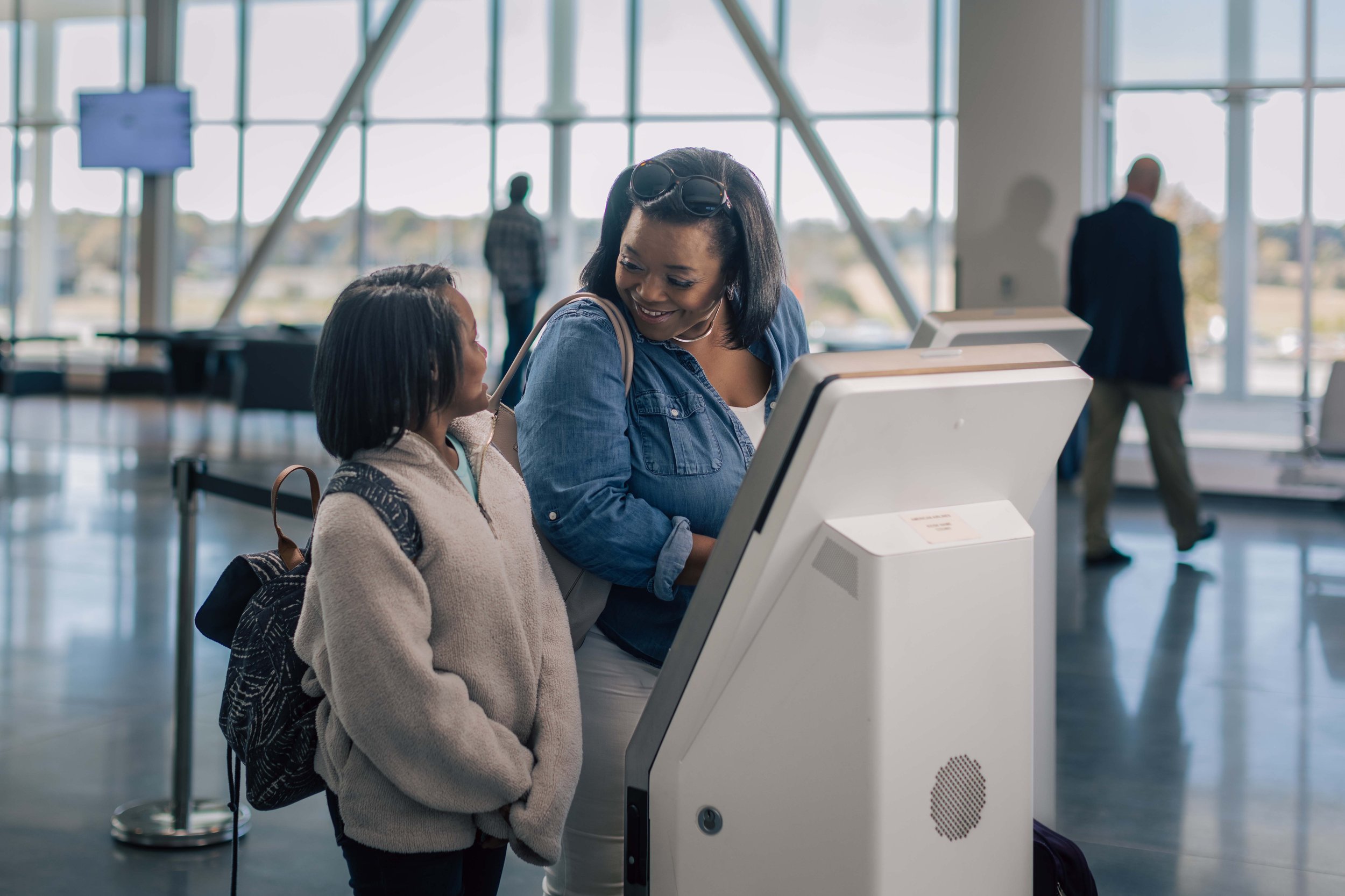
Light and Texture: We emphasized a light and airy visual style that conveyed a sense of openness and comfort.
Movement and Space: Dynamic visuals were used to illustrate the sense of movement and the spaciousness.
Professional yet Exciting: The campaign struck a balance between professionalism and excitement, ensuring it appealed to a wide range of travelers.
Brand Story:
"COU helps to make ‘more’ possible - travel more, be home more, explore more." This narrative was crafted to communicate the Airport's role in enabling people to expand their horizons and enjoy more opportunities.
Our Execution:
The production team knew there was only a small window to shoot our footage between when the terminal was completed and when it would be in operation. We focused first on pre-production and developed an exact shot list, recruited actors and made sure we were ready to make the most of the time we had with an organized team who knew exactly what they were doing and when.
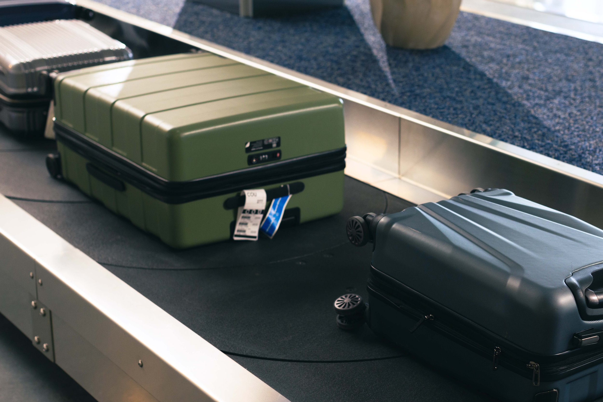
We captured footage and photos that showcased both the overall feel of the space and the amenities of the new terminal. Custom music was arranged to match the elevated travel experience and was used in all audio and video ads. In addition to using the photos in banner ads and social media posts, we provided them to the client for the website.


